Madic: For The Wanderers
Branding | Web Design
Opportunity
Re-brand an established business complete with a brand standards manual, physical and digital touchpoints.
Solution
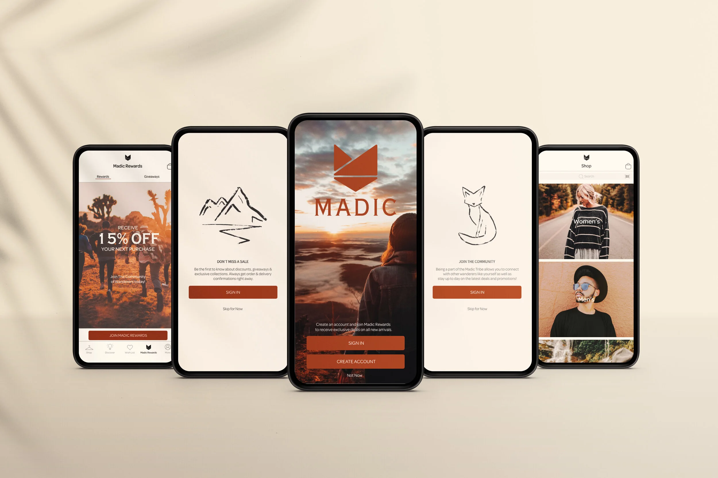
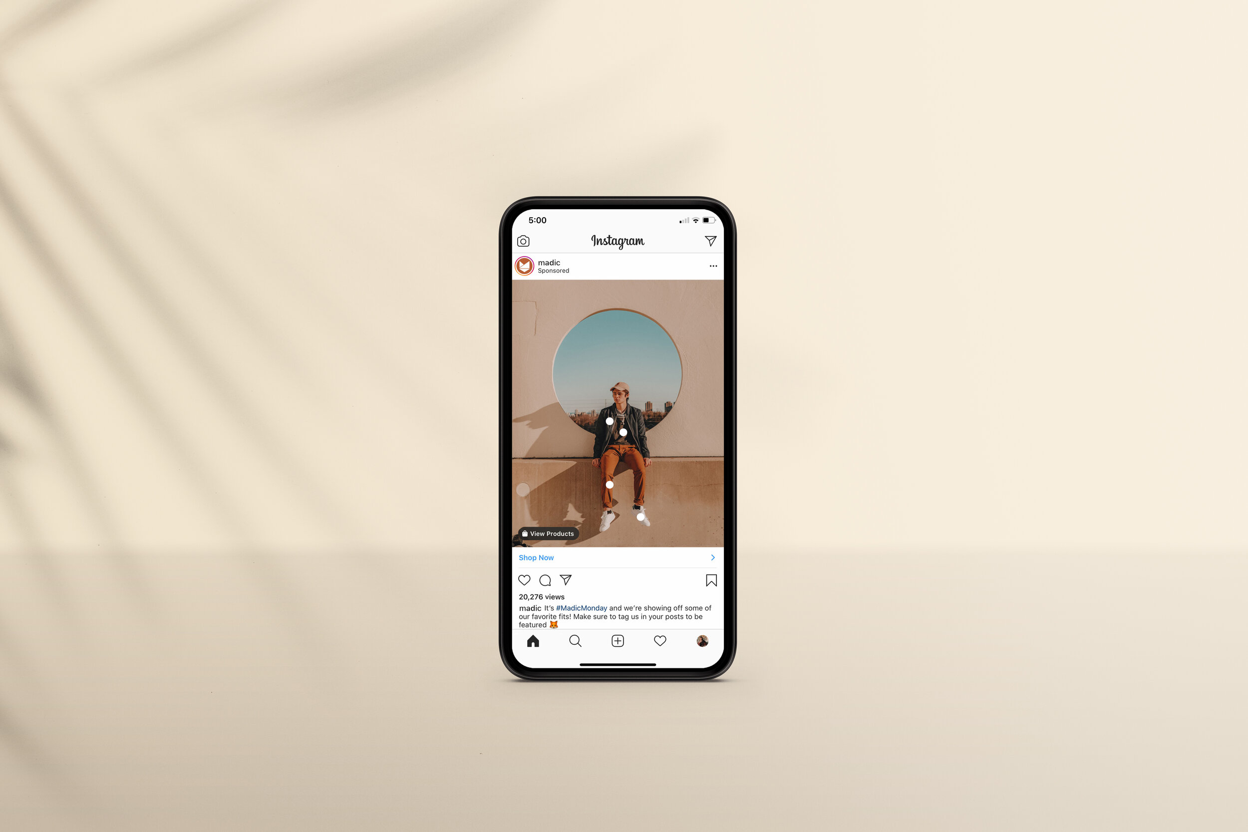
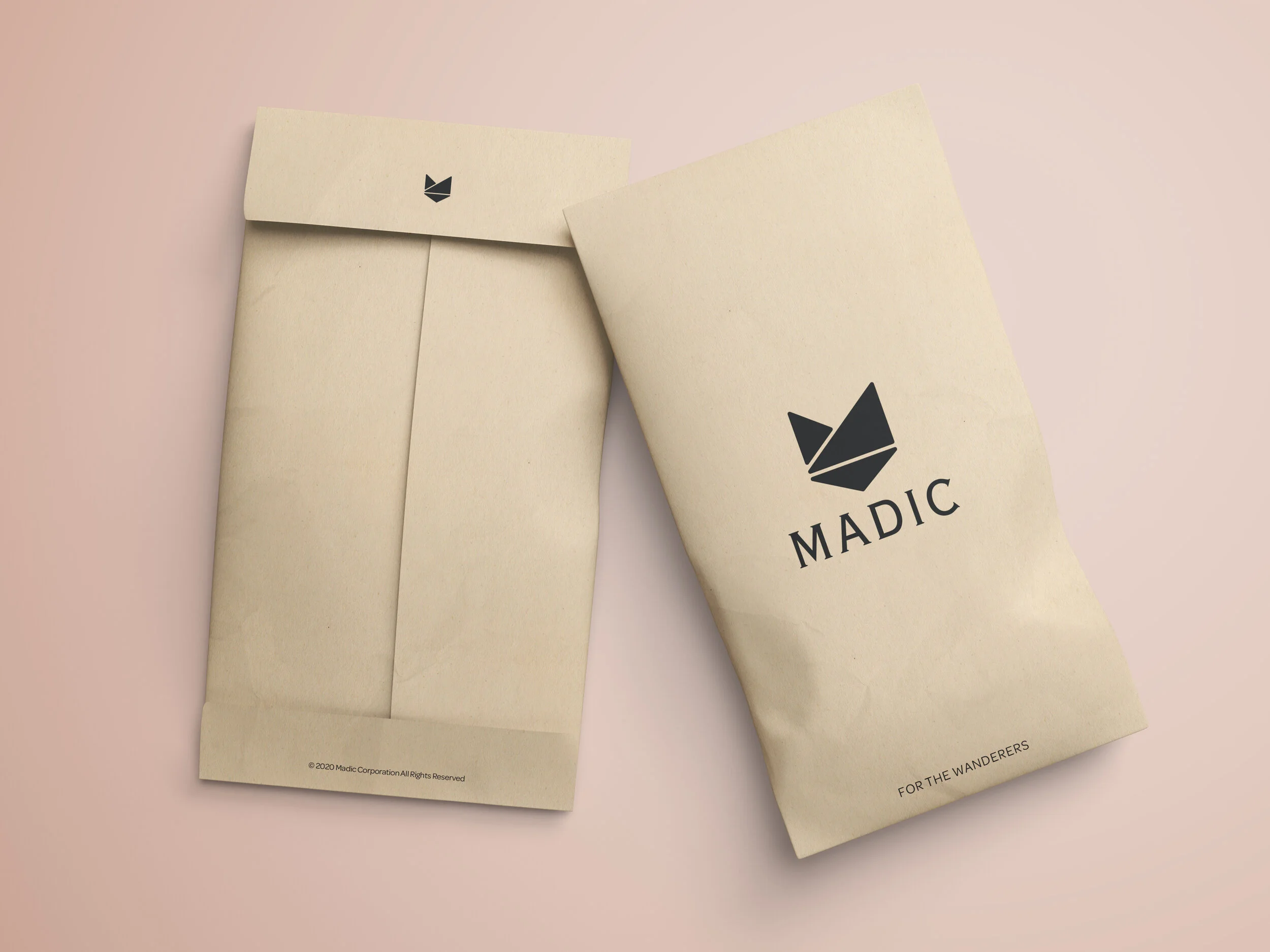
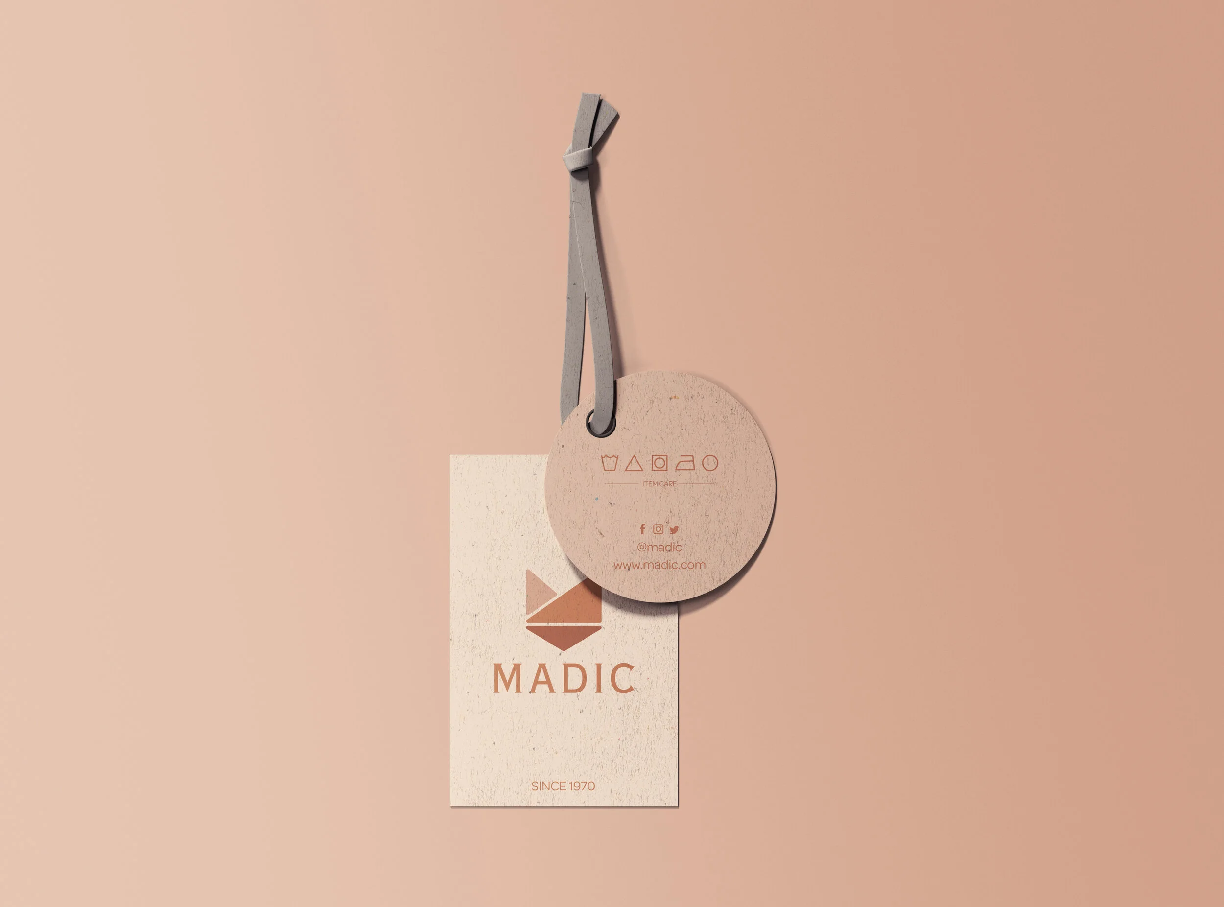
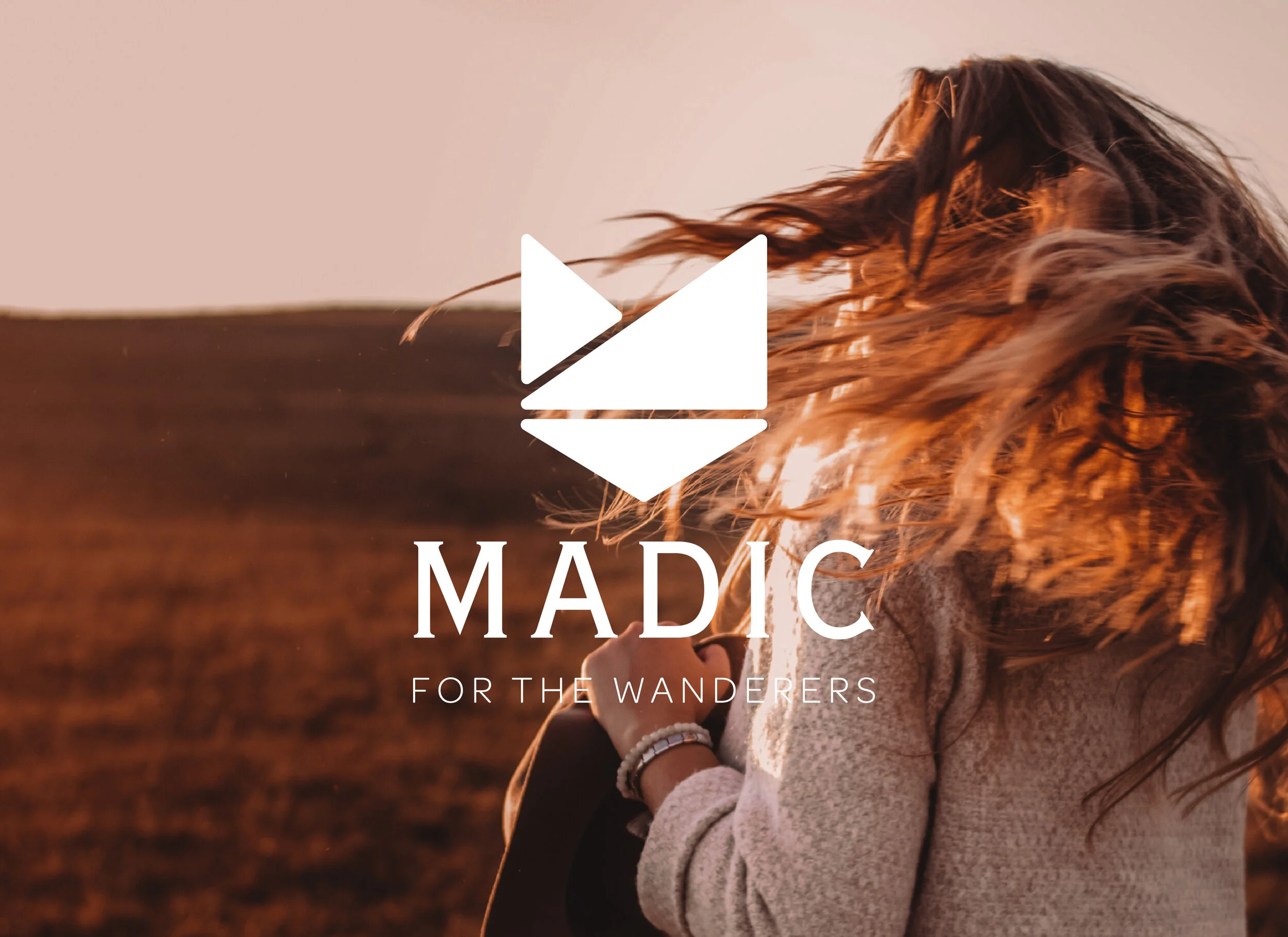
When re-branding Urban Outfitters, I wanted to keep the existing target audience age range, but adjust the demographic slightly. I decided to change the aesthetic from a city, street style to a more adventurous, outdoor style. In doing this, I changed the logo to symbolize the main destinations of travel– the mountains the sea and the city. I also tied in the symbols of a fox and the letter M, as a nod to the new name of the company, Madic. Madic takes the “no” out of “nomadic” and represents the wandering spirit that lives inside of us all. The tagline “for the wanderers” establishes the goal of the brand. Madic aims to provide apparel for those who travel often. The brand is more rugged and earthy than the original and targets young adults from all areas of the world, not just cities. I created bags, clothing, labels and signage as well as an app, website and social media advertisements.
View the full brand standards manual